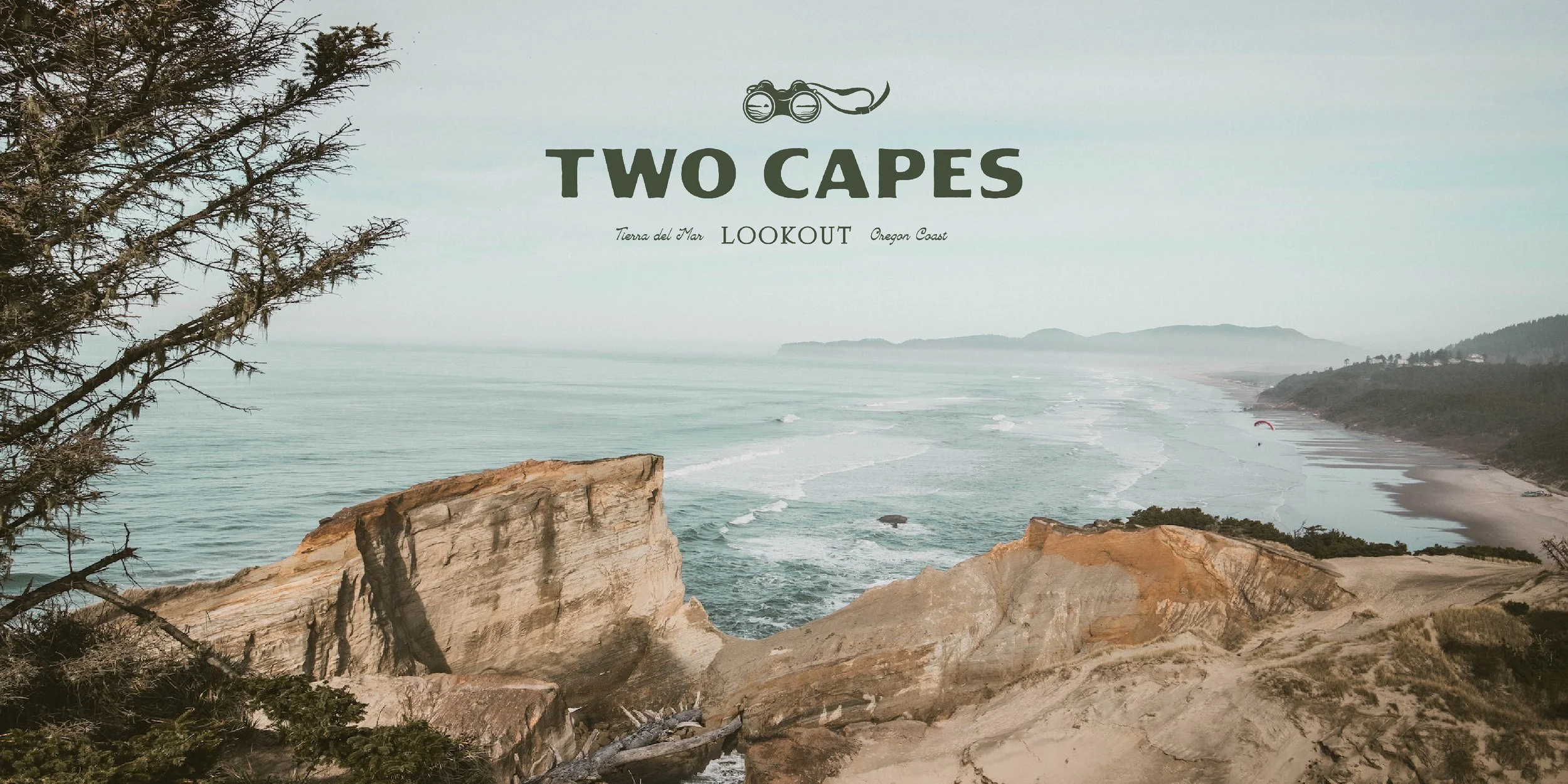
Two Capes Lookout
Located just a stone’s throw from the popular tourist town of Pacific City, Oregon, Two Capes Lookout was envisioned as a uniquely peaceful wilderness retreat. With just a handful of cabins and geodesic dome sites spread across acres of lush coastline, the immersive experience of a stay on the property would also inherently expose guests to the preservationist philosophy underpinning its founding.
We were brought onto the project when the Two Capes team—composed entirely of first-time hospitality entrepreneurs—was finalizing their plans for the grounds and physical layout of the resort. Building on the conceptual work done by the incredible architectural team at Studio Campo, our goal was to capture the unique topography and pristine beauty of the property, differentiating the guest experience within a densely crowded hospitality market.
LOCATION
Tierra del Mar, Oregon
PROJECT SCOPE
Logo Design + Visual Branding
Brand Positioning + Copywriting
Website Design
Merch Design
COLLABORATORS
Studio Campo, Architecture
The Opportunity
While this general region of Oregon has already become a popular tourist destination, the specific stretch of coastline that houses Two Capes Lookout had only recently become available for development. Located between Cape Kiwanda and Cape Lookout, the property feels both remote and centrally located to many of the region’s outdoor attractions, yet stands out from some of the more lively lodging options due to its limited number of glamping sites and efforts to preserve the natural landscape.

The Challenge
As a project led by multiple founders, all of whom are first-time hospitality entrepreneurs, it was important to us to find a balance between leveraging our industry knowledge and ensuring our work represented the unique vision of the client. By listening carefully to the leadership team and asking strategic questions, we were able to arrive at a visual and verbal brand identity that they not only loved, but that mirrored the way they spoke and felt about the property.
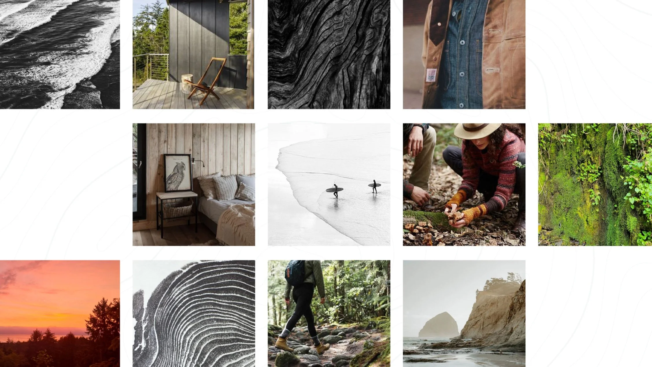

Logo Design
Our branding emphasized the property's stunning juxtaposition of Sitka Spruce forests, marshland and secluded beaches—literally zooming in on the views with a playful binocular illustration highlighting both capes. At the same time, our core messaging sought to capture the preservationist philosophy guiding the construction of the resort, as well as the wealth of protected parks and natural areas within a stone's throw of the resort's central location.

THOUGHTS FROM THE CLIENT
“Partnering with Cognoscenti Creative was the perfect jumpstart to defining our brand. New to the hospitality industry, we knew our property and services were unique, but we weren't sure how to portray our message visually and verbally. Lauren came up with a creative logo that captures everything perfectly, and Carly's copy statements capture how we want to share our story with customers. We are thankful for the partnership, their ability to listen, and guidance.”