Layers & Lines
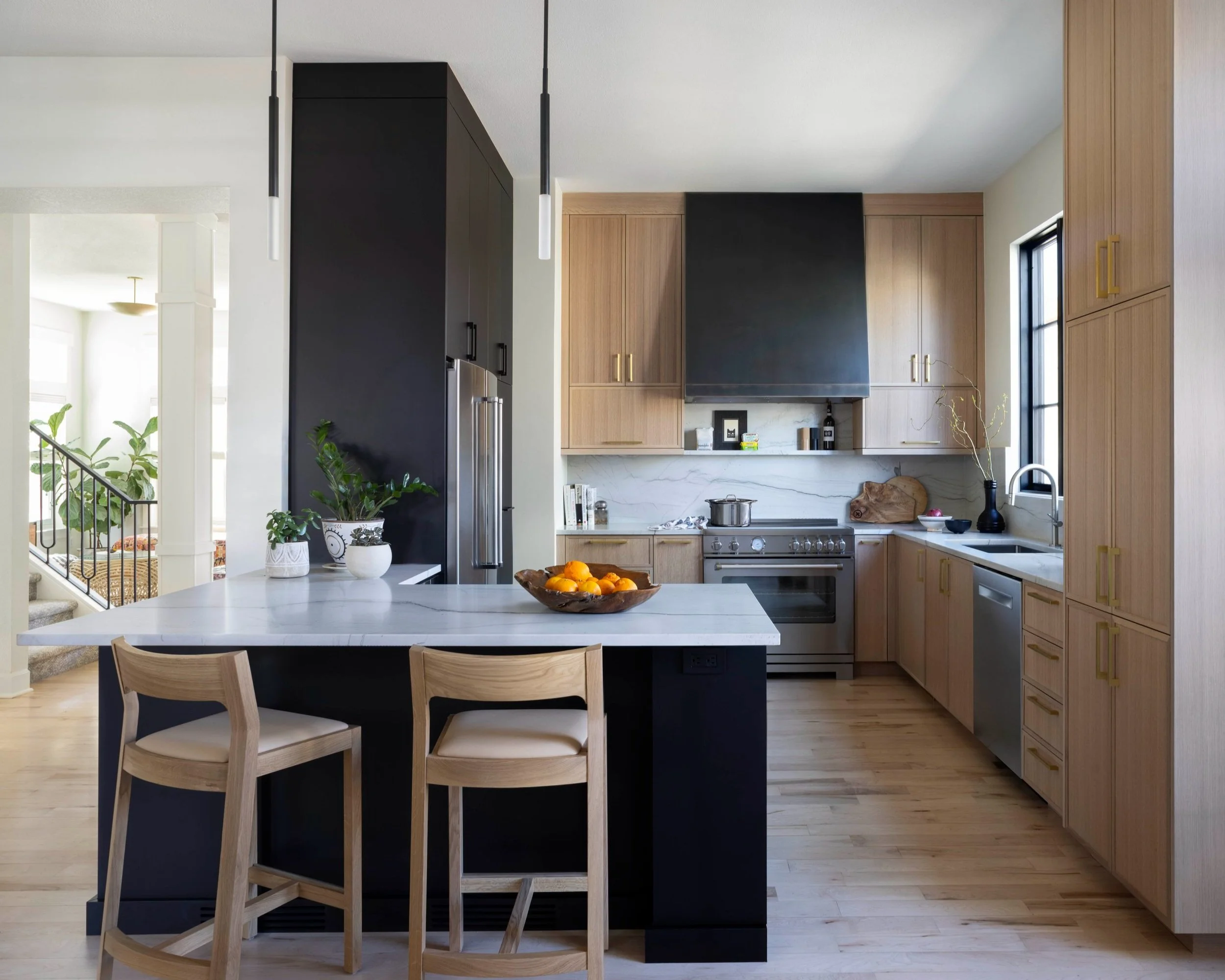
Since founding their residential interior design company—Layers & Lines—in 2016, founders Kim and Molly had built a portfolio of awe-inspiring homes, yet their busy schedules hadn’t allowed significant investments or updates to their brand identity and communications. As they continued to pursue projects with an increasingly discriminating set of Denver home owners, it became clear that a holistic brand refresh could help bring their business to the next level.
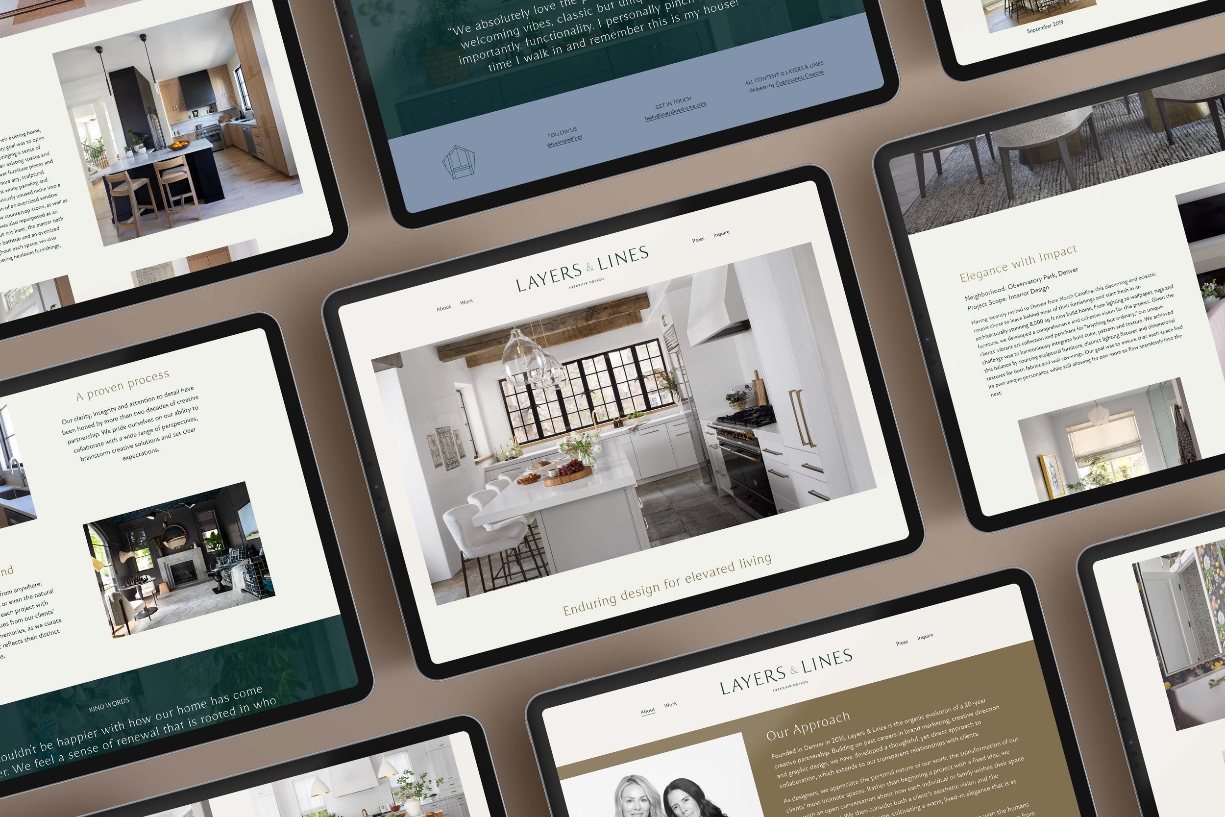
Clearly identifying and articulating the client’s differentiating factors in the market was central to our work, as they had previously relied heavily on imagery to sell their services. We also revisited the team’s visual branding and redesigned their website, including the copywriting and design of portfolio case studies that better represent Kim and Molly’s intuitive and personal approach to working with their clients. Last but not least, we created an evergreen email series (to be sent to all new newsletter subscribers), helping to introduce this talented team to a growing audience of potential customers and collaborators.
LOCATION
Denver, Colorado
PROJECT SCOPE
Logo Design + Visual Branding
Brand Positioning + Copywriting
Website Design + Content
Email Marketing
COLLABORATORS
Emily Redfield, Photography
Kylie Fitts, Photography
The Opportunity
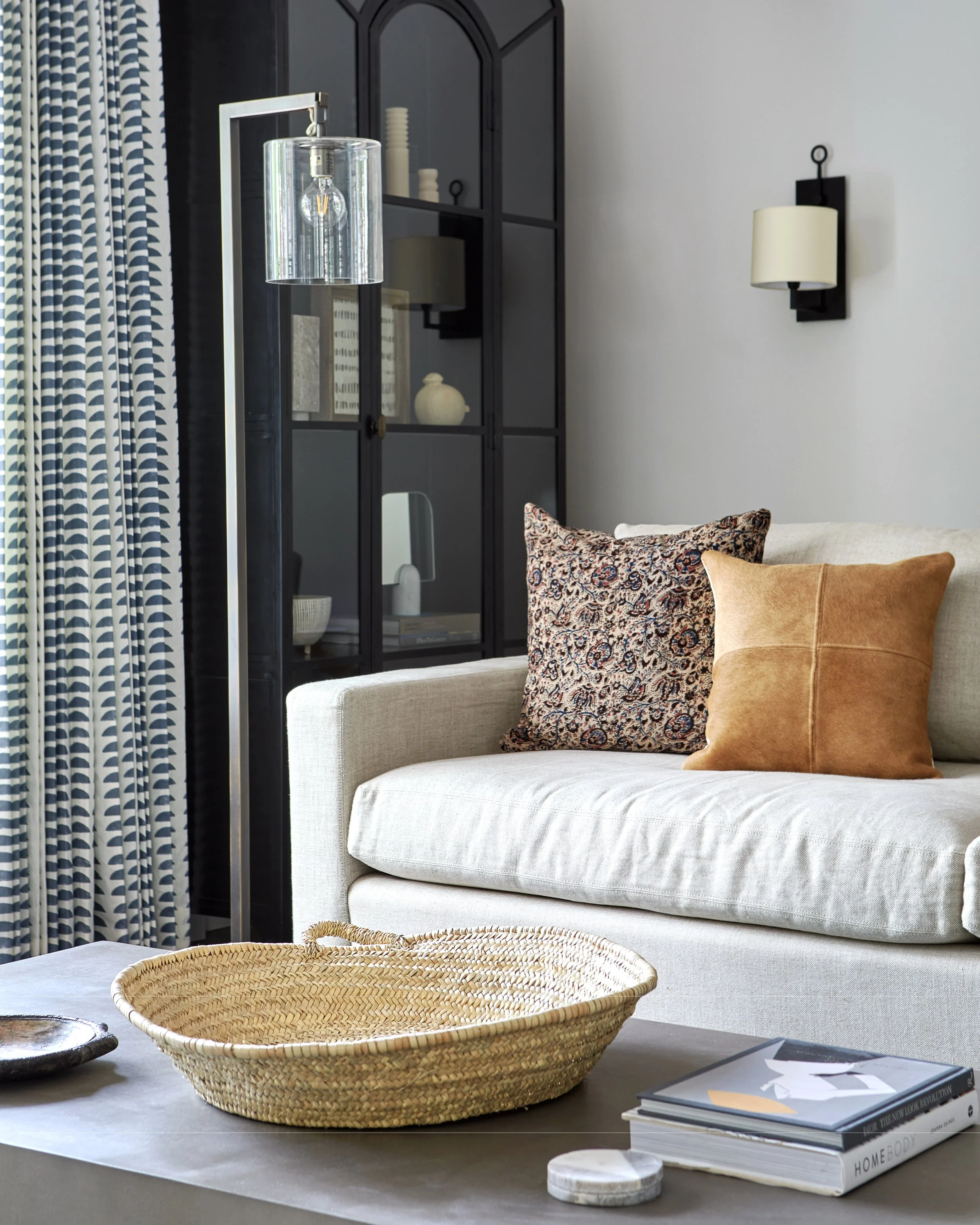
While Molly and Kim’s original branding and website was certainly tasteful, it didn’t fully represent the nuance and elegance of their work. More importantly, the founders had never made a strong written case for why a client would choose them over another designer. In turn, this comprehensive rebranding project represented the opportunity to meaningfully stand out in a competitive local design market.
The Challenge
As with many founders, Kim and Molly took the public representation of their company very seriously—and personally. This project required a close collaboration with the client, both listening with an open mind to their highly detailed feedback and making strategic recommendations informed by our own expertise. This all-hands-in approach led to a result that was truly greater than the sum of its parts, and most importantly, a brand presence that feels true to the spirit and ethos of this company.
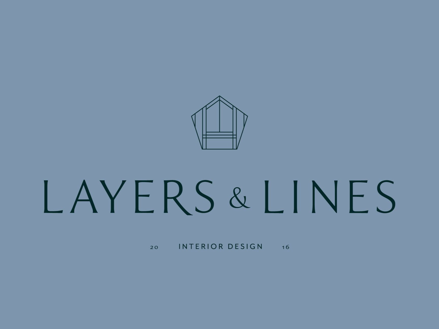
The Logo
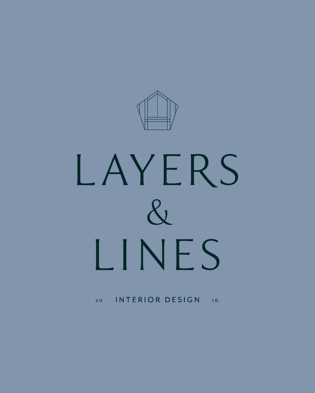
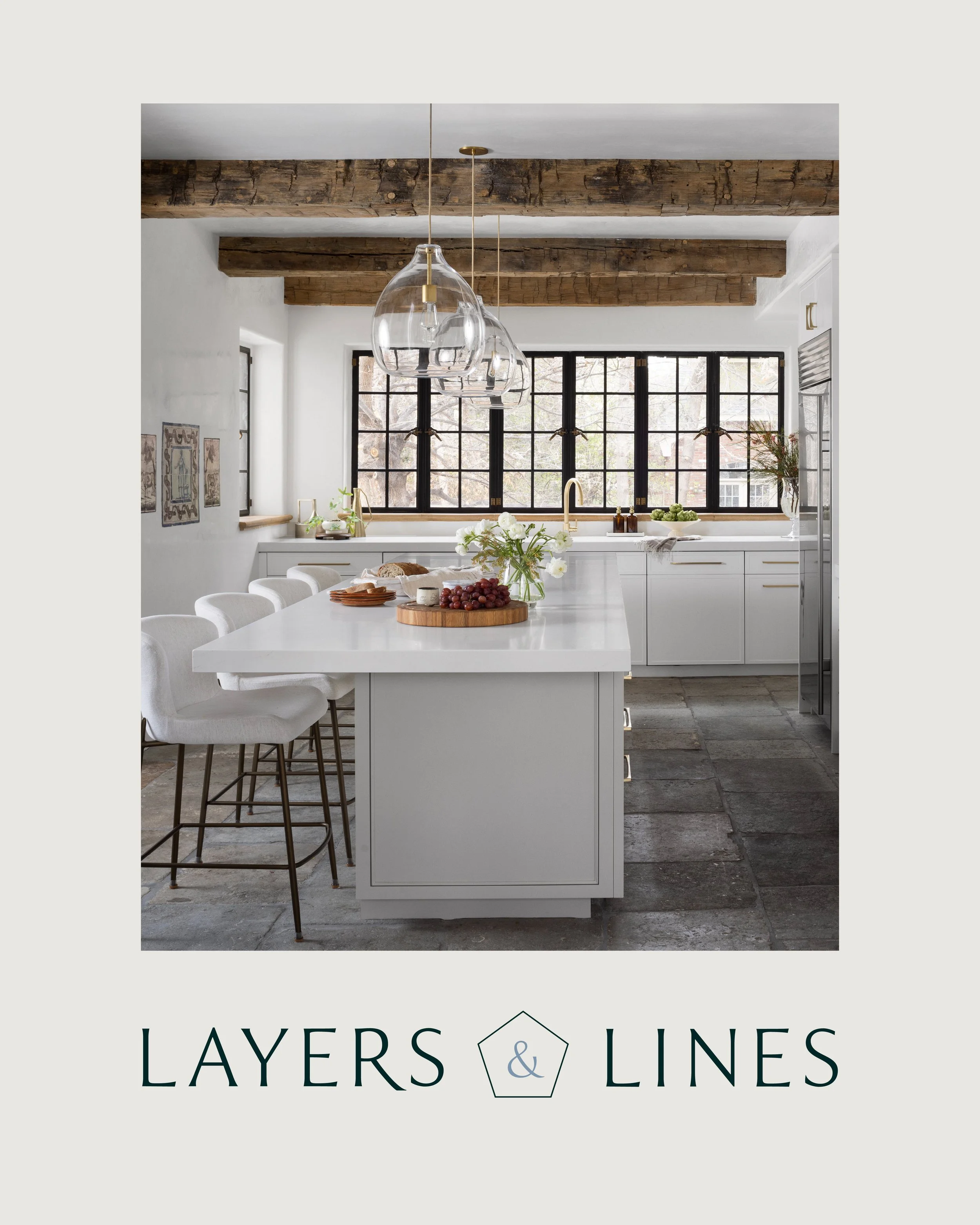
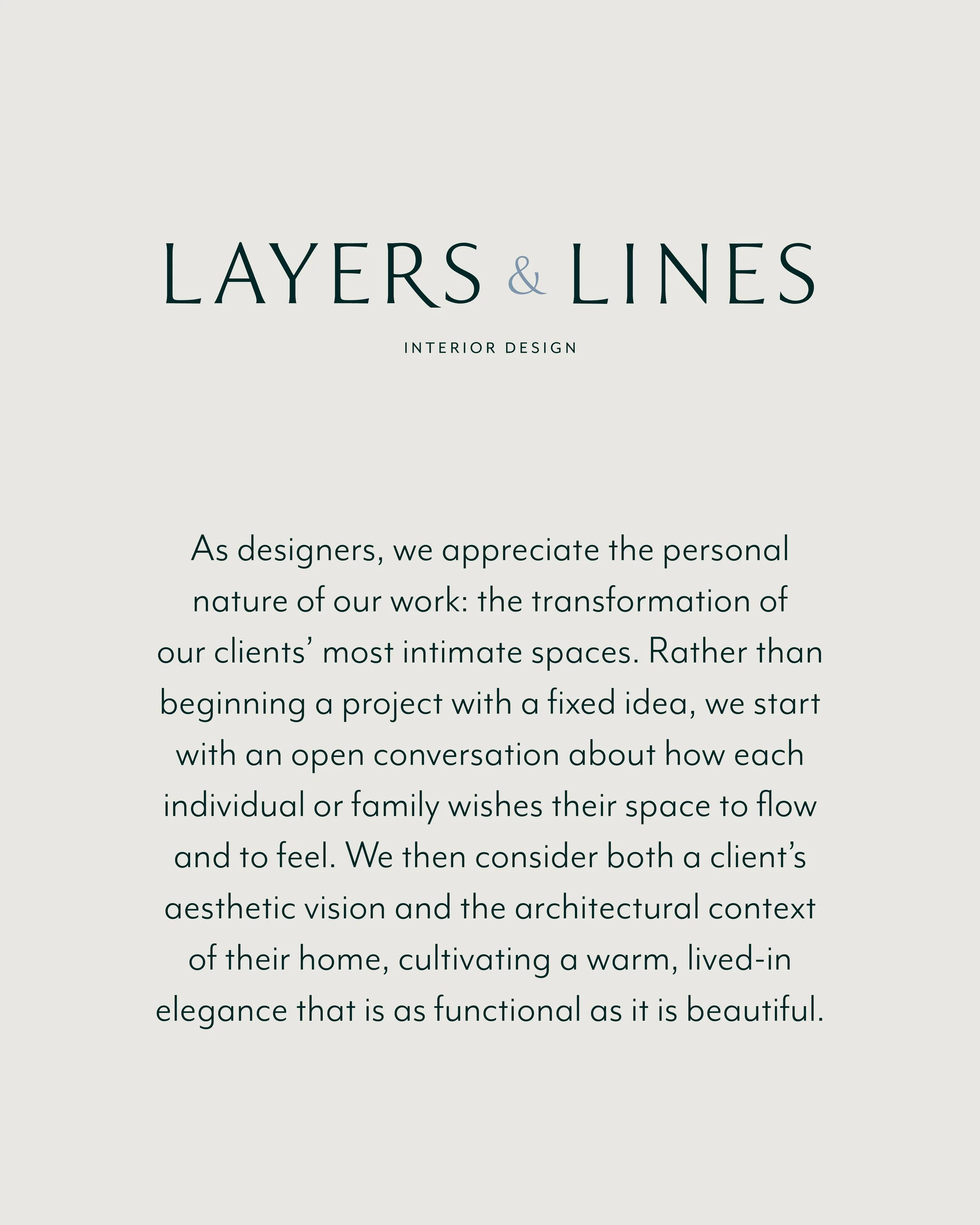
Creating a logo for other design professionals is never an easy task—and in this case, it was incredibly important to create a refined, identifiable aesthetic that represented the taste level of the client. By seeking to subtly reference the home design sector (without being too on the nose) and pairing this new, minimalist icon with fonts and colors that felt beautifully established, we were able to land on a visual identity that truly represents the vision and values of the Layers & Lines team.



THOUGHTS FROM THE CLIENT
“We got a lot out of our experience working with Lauren and Carly on our firm's rebrand. Their process is very collaborative and we were confident all along the way that they were actively listening to what we hoped to accomplish. In the end, Cognoscenti's understanding of our goals and the beautiful ideas they brought to us resulted in an elevated brand identity that will help Layers & Lines reach the right clients and partners as we work to expand our business.
We look forward to continuing our partnership as we extend our brand in new ways. The value Lauren and Carly bring through their experience and creative talent keep us focused and excited for more!”

